How Grocery Stores Are Cleverly Designed to Make You Spend More Money
By Casey Chan, Sploid, 26 January 2016.
By Casey Chan, Sploid, 26 January 2016.
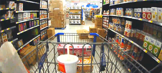
We’re all fools who get easily convinced by marketing and store design tricks because we can’t save ourselves from ourselves. Here is a short video from Wendover Productions detailing some clever layout design grocery stores use to get us to spend more money. They include putting the entrance to the right because we like to shop counter clockwise, having items we need spread all across the perimeter of the store to make us walk more, to put cheap items at the end of every aisle, to make sure profitable products are at eye level, and so on.
No comments:
Post a Comment
Please adhere to proper blog etiquette when posting your comments. This blog owner will exercise his absolution discretion in allowing or rejecting any comments that are deemed seditious, defamatory, libelous, racist, vulgar, insulting, and other remarks that exhibit similar characteristics. If you insist on using anonymous comments, please write your name or other IDs at the end of your message.